Track your weekly marketing campaign metrics using Dax in Excel — Part 2 — Building the Data Model

In the first part of our series, we familiarized ourselves with the dataset and laid the foundation by converting our tables into dynamic ones and introducing them to Excel’s data model. Now, let’s dive deeper. In this section, we’ll explore the intricacies of the data model, craft relationships between our tables, and initiate our journey with DAX by authoring basic measures.
To enable Power Pivot for the first time in Excel.
- Go to File > Options > Add-Ins.
- In the Manage box, click COM Add-ins> Go.
- Check the Microsoft Office Power Pivot box, and then click OK.
Setting up the Data Model
Accessing the Data Model:
- Navigate to the “Power Pivot” tab in Excel.
- Select the keywords Table.
- Click on Add to Data Model.
- Select the Calendar Table then add it also to the Data Model.

Viewing Tables in the Model:
- Click on “Manage” to open the Power Pivot window.
- Inside the Power Pivot window, you’ll see tabs at the bottom representing each table we’ve added. Familiarize yourself with each; this understanding is pivotal as we begin crafting relationships.
Building Relationships
Creating a Relationship:
- Still, within the Power Pivot window, click on “Diagram View” on the top right. This presents a visual representation of our tables, making it easier to establish relationships.
- Drag the “Date” field from the calendar table to the “report_date” field in our keyword performance dataset. This creates a link, allowing us to leverage time intelligence.
Remember, relationships are crucial because they enable us to combine data from different tables efficiently, without VLOOKUPs or other tedious formulas.

Crafting Basic DAX Measures
Simple Measure — Total Spend:
- Go back to the “Data View” in the Power Pivot window.
- Select the table containing your ad metrics.
- Select a cell and write in the formula bar:
total_spend:=SUM(tb_keywords[ad_spend])
Another Basic Measure — Total Clicks:
- Following the previous steps, create another measure named “Total Impressions” with the formula:
total_clicks:=SUM(tb_keywords[ad_clicks])Integrating Pivot Tables with our Data Model
With the data model in place, we unlock the power of PivotTables, enabling us to visually represent and analyze our data seamlessly.
Initiating a PivotTable from the Power Pivot Window:
- While still in the Power Pivot window, locate the “PivotTable” button at the top.
- Click on it and choose where you’d like to place the Pivot Table in your Excel workbook.
Structuring the PivotTable:
a. Rows:
- Drag “keyword_text” from our keyword performance dataset to the “Rows” area of the PivotTable. This action neatly lists out each keyword, offering a detailed view of our metrics per term.
b. Values:
- Introduce our previously defined measure, “Total Spend”, to the “Values” sector. This populates each keyword’s corresponding ad spend, showcasing the financial input behind every keyword.
c. Slicers for Time Analysis:
- While in the PivotTable, navigate to the “PivotTable Tools” on the Excel ribbon, selecting “Insert Slicer”.
- In the ensuing dialog box, pick “Week Name” from our calendar table. Implementing this adds a slicer, enabling effortless week-by-week filtering of our data.
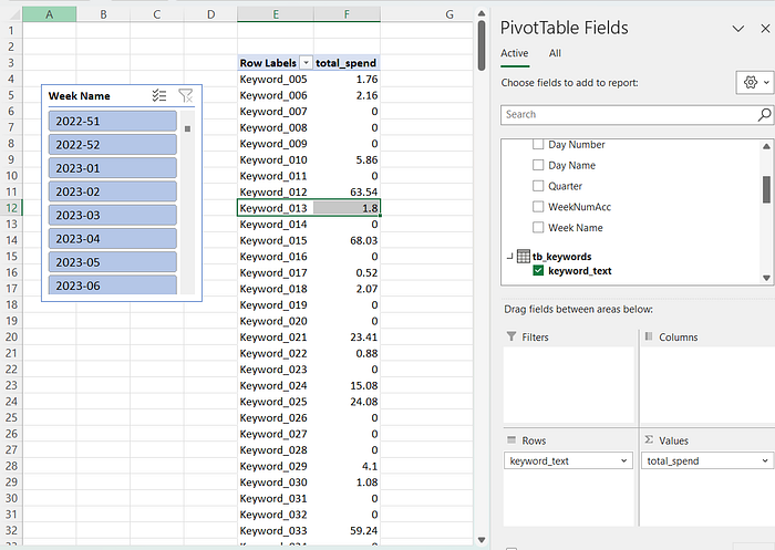
Now, with a few simple clicks, we can witness how our ad spend varies by keyword, and using the slicer we can observe the fluctuations week by week. This capability transforms static data into dynamic insights, allowing for more informed marketing decisions.
For those eager to follow along, you can download the dataset from this link. Having the data on hand will provide a practical experience as we navigate through each step together.